Previously I pointed out how rotating navigation mechanisms are on the rise. These are content areas that show multiple items within the same space on the page. There is often an automatic part of the mechanism that “plays” through all of the items, but there may also be paging controls to jump right to a given item in, say, a sequence of 3 things. It’s a good way to make use of screen real estate and surface content without cluttering the page.
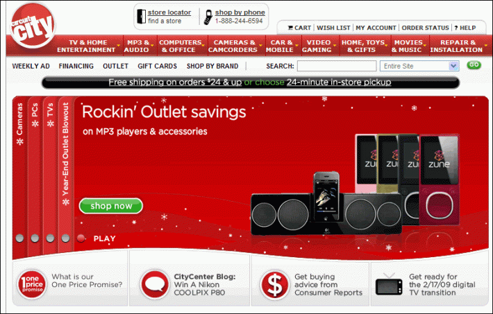
This trend seems to be continuing. Of particular interest is the rotating navigation element on the CircuitCity.com homepage:
The vertical text bars on the left are clickable to reveal a new piece of content in the middle. After clicking one of them, the top piece of content rotates to the end of the stack of vertical bars. It’s as if you have a stack of cards in your hand that maintain a constant order as you flip through them. To look at the third card, you take the top two and place them at the end of the stack. Interesting metaphor for interaction. I got it right away.
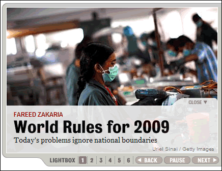
Newsweek also has a rotating element on their homepage for headline stories. The controls for this are quite complete: next, previous, paging, and the ability to play all.


Another great example is the website of Kamil Gottwald http://www.iameuropean.com
Andreas
Pingback: Carousel Navigation (was rotating navigation) « Experiencing Information
It’s worth noting that carousel devices have a potentially serious drawback: they impose a strong hierarchy on what they are showing, and hide what they are not. For larger data sets, this works against the ability of people to “forage” for information by making them less able to determine its “scent.” That may be perfectly fine, depending on the context of course. It depends.